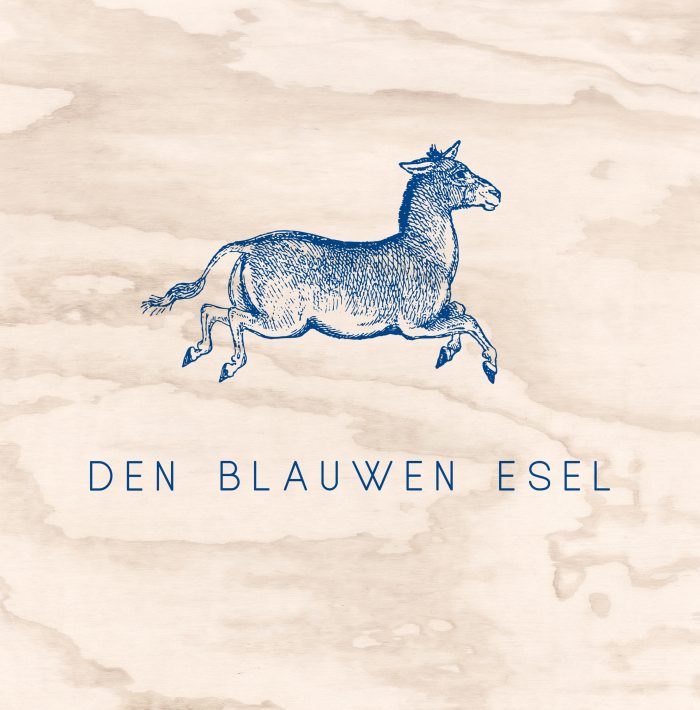
Within this 16th century building, 3 modern tourist studios were created. This fantastic house was then given its original nutty name again: “Den blauwen esel” (The blue mule).
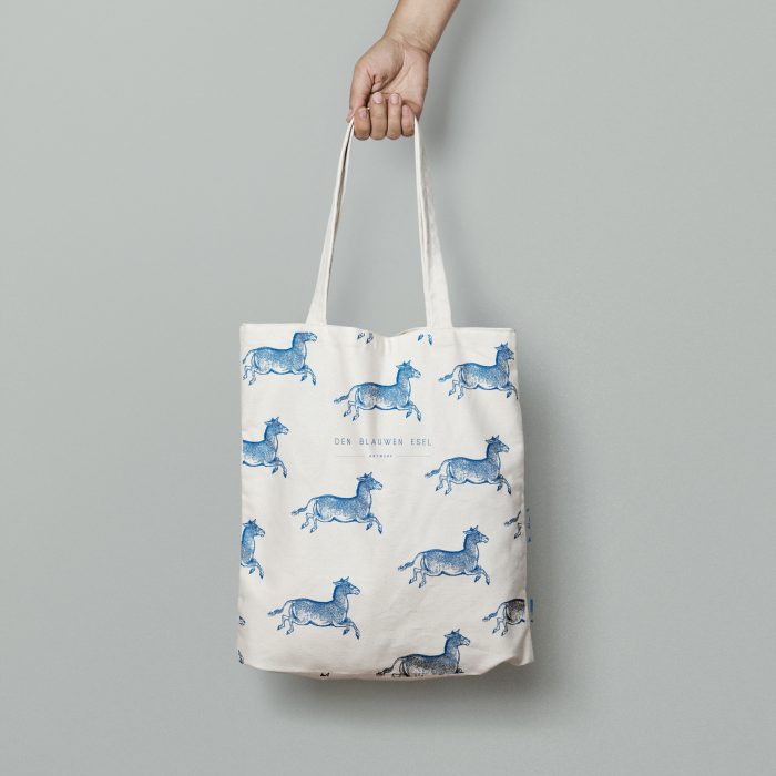
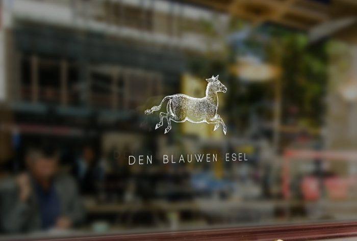
It was self-evident that the logo needed to join this return to the roots. So, consequently I took it upon me to find a 16th century illustration of a mule. This particular etching also reminded me of that saying ‘Counting sheep to get to sleep’, so that was more than perfect.
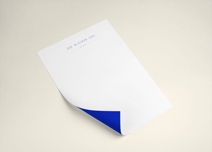
The lettering was kept clean and modern, to reflect the ‘old vs. new’ character of the studios.